Big Data & BI
Transforming Nonprofit Reporting with an End-to-End Tableau Analytics Suite
We partnered with a national nonprofit dedicated to helping adults transition into high-demand careers. They support thousands of learners each year but lacked a clear way to measure how trainees moved from website engagement through training completion and into job placement. DataNicely designed a modern reporting solution that unified datasets and delivered actionable insights across programs.
What was the main challenge in this project?
The nonprofit collected large volumes of data across systems—Google Analytics for website activity, a Learning Management System for training progress, and CRM data for job outcomes—but had no centralized reporting or visibility into the full learner journey. Manual Excel reporting was time-consuming and limited insights for leadership and funders.
What was your solution or approach?
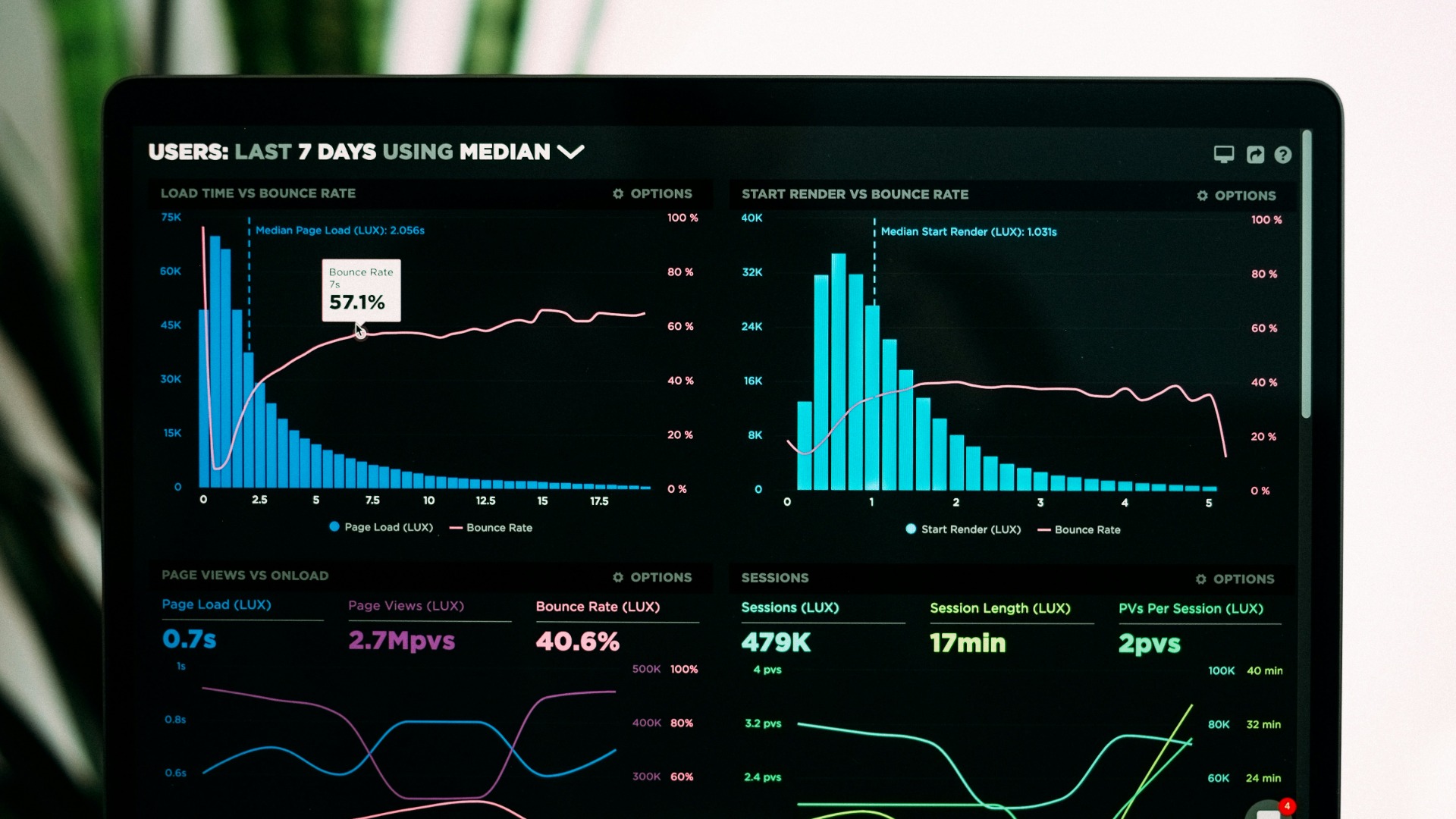
• Developed a unified data model combining web, enrollment, and employment data into a single source of truth
• Built an interactive Tableau reporting suite focused on key program metrics: learner drop-off rates, course completion, and job placement outcomes
• Designed executive dashboards tailored to leadership, funders, and program managers
• Automated data refreshes and rolled out training to internal staff to ensure long-term usability
What was the outcome or impact for the client?
• Leadership gained real-time visibility into learner progress and outcomes
• Decreased reporting time from days to minutes
• Improved funding proposals with stronger, data-backed impact narratives
• Identified key dropout points resulting in targeted program improvements and increased course completion rates
Other big data & bi case studies
Big Data & BI
Project Details
D
Industry:Nonprofits & NGOs
Budget:$10,000 - $50,000
TableauSQLGoogle AnalyticsData EngineeringData ModelingDashboard Design
Need similar services?
Agencies providing big data & bi
Posted this
D
Unlock the Power of Your Data Nicely
D
Get double glazing for your existing windows & doors
I
AI Agent Development Company in USA