Branding
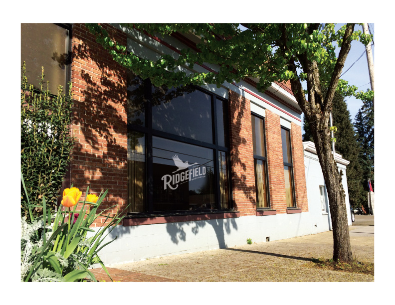
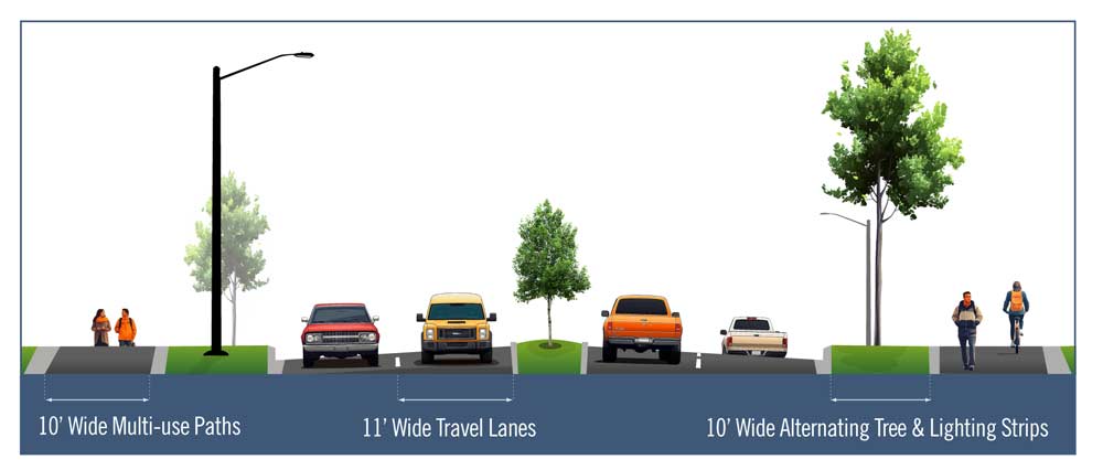
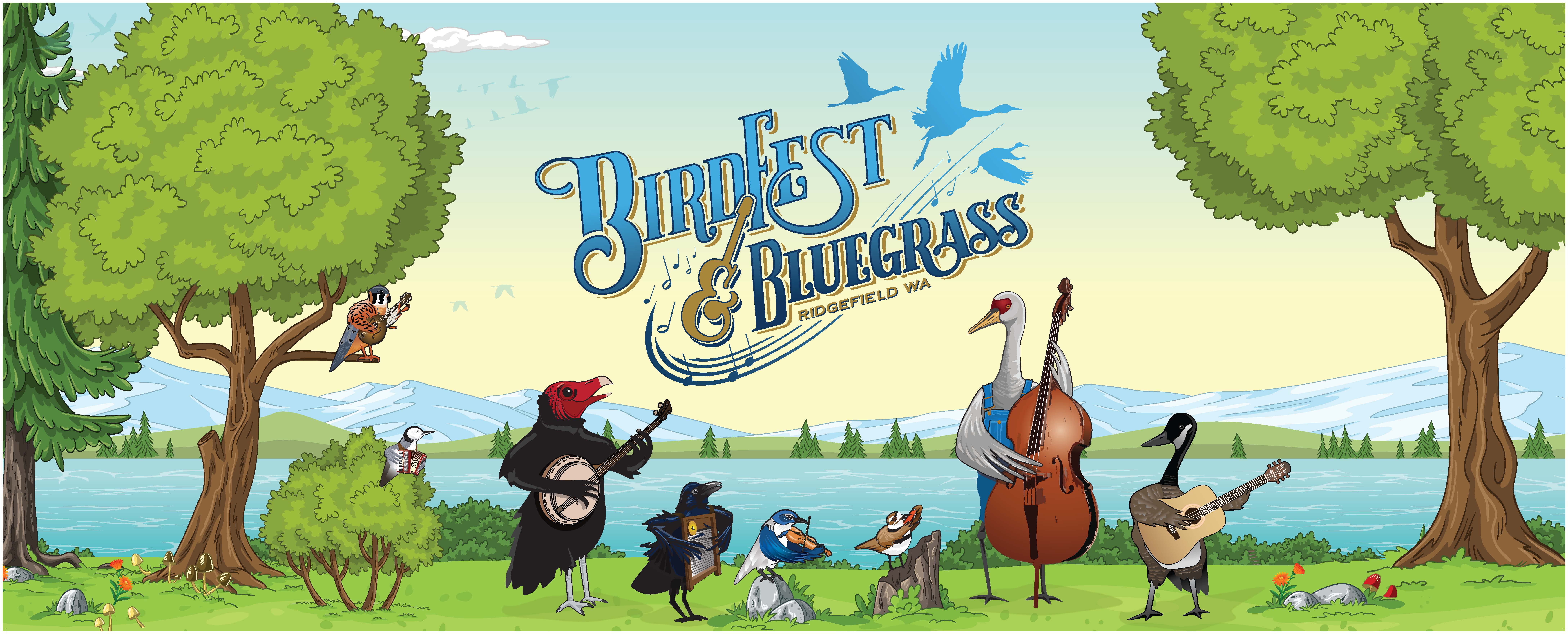
City of Ridgefield, WA
In 2015, Ridgefield was one of the fastest-growing cities in Washington. But its identity had not kept pace with its momentum. The City needed a cohesive brand that could unite longtime residents and new arrivals, reflect its character, and stand out in a crowded regional landscape.
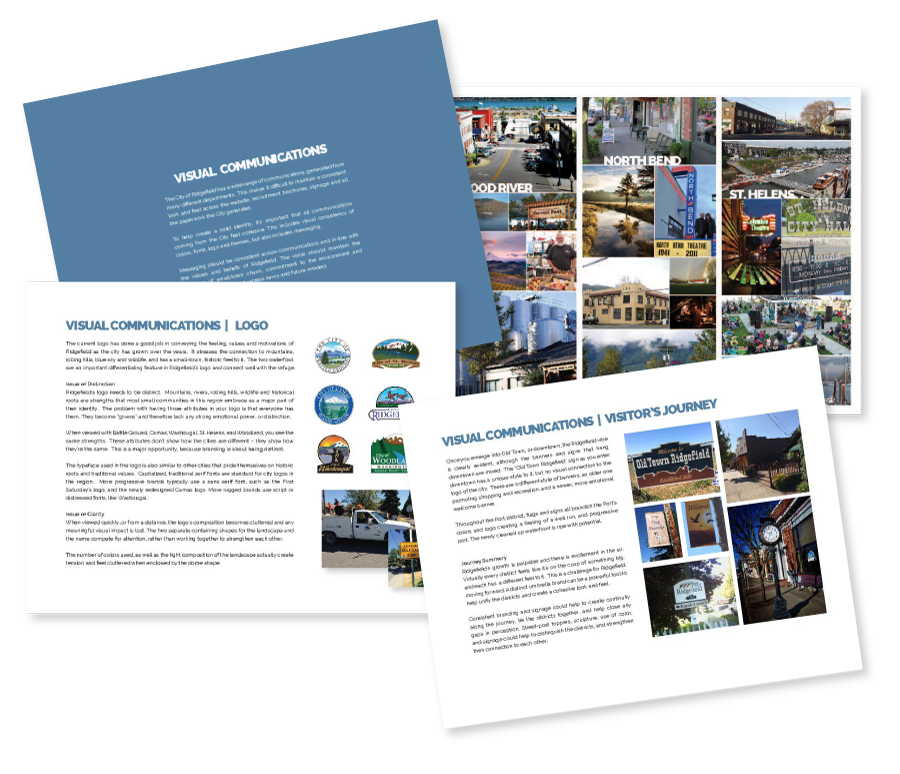
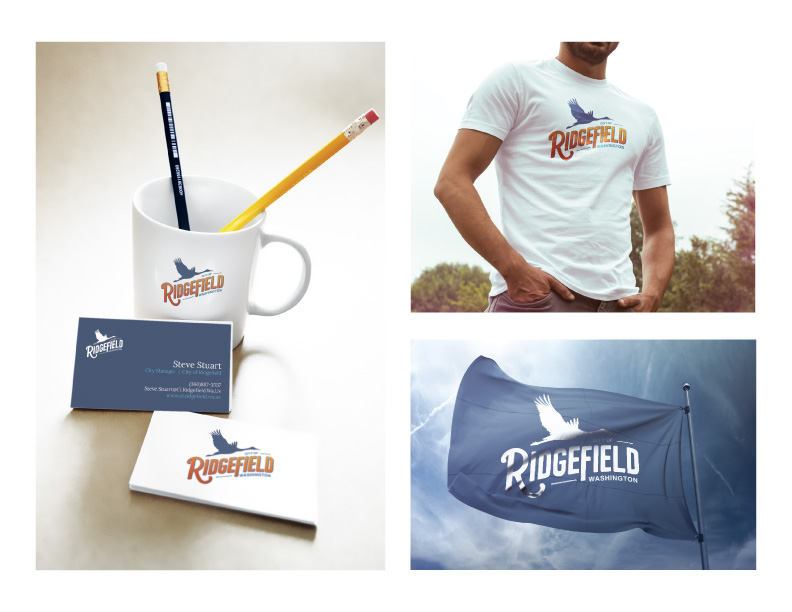
This was not just about designing a logo. The goal was to build a complete brand system that included strategy, messaging, visual identity, and a thoughtful rollout plan that would work across every department and platform.
What was the main challenge in this project?
Finding the authentic balance between the older, more consrvative generation with the younger, more progressive residents.
What was your solution or approach?
The project was organized into three phases: research and engagement, design, and implementation. Each step was built on collaboration, clarity, and a long-term vision.
What was the outcome or impact for the client?
When this project began, Ridgefield was a small city of fewer than 7,000 people. Today, it is home to more than 15,000 and continues to grow.
Ten years later, the brand is stronger than ever. Ridgefield has seen a sharp rise in population and revenue. The City is investing heavily in infrastructure and public facilities and attracting major retailers, employers, and new residents from across the country.
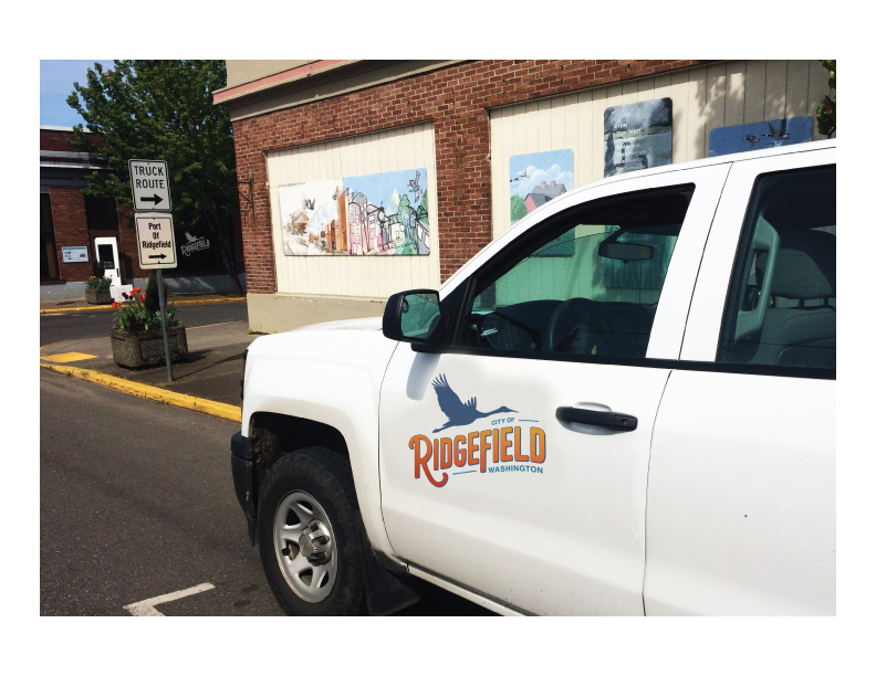
But the most meaningful result? Pride. Ridgefield’s new brand gave the City a voice and visual identity the community could stand behind. It helped unite departments, leaders, and residents around a shared story and created new opportunities to connect with the public in more consistent, engaging ways.
The rebrand gave Ridgefield more than a visual update. It provided a clear, authentic foundation for growth, communication, and civic pride that continues to deliver value year after year.
A Lasting Partnership
The work didn’t end with the rebrand. Since the launch, I’ve continued to support the City of Ridgefield with a wide range of design and branding needs that keep the identity fresh, consistent, and relevant.
From event branding and marketing to newsletters, direct mail, murals, and historical plaques, I help the City show up with clarity and creativity across every touchpoint. I’ve also led branding efforts for the Historic Downtown District and supported the communication of Ridgefield’s ongoing growth and investment.
The City continues to trust me as a creative partner—someone who understands the brand from the inside out and can help maintain its integrity as the community evolves.
Other branding case studies
Branding
MMake My Brand
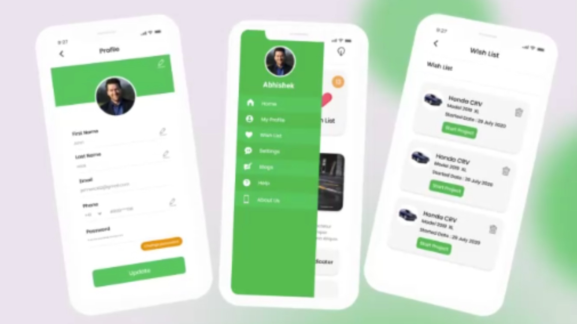
Cars Centro: Redefining Automotive Marketplace Experience with Design-Led Innovation
Design & DevelopmentBrandingUI/UX Design+2
Branding
MMake My Brand
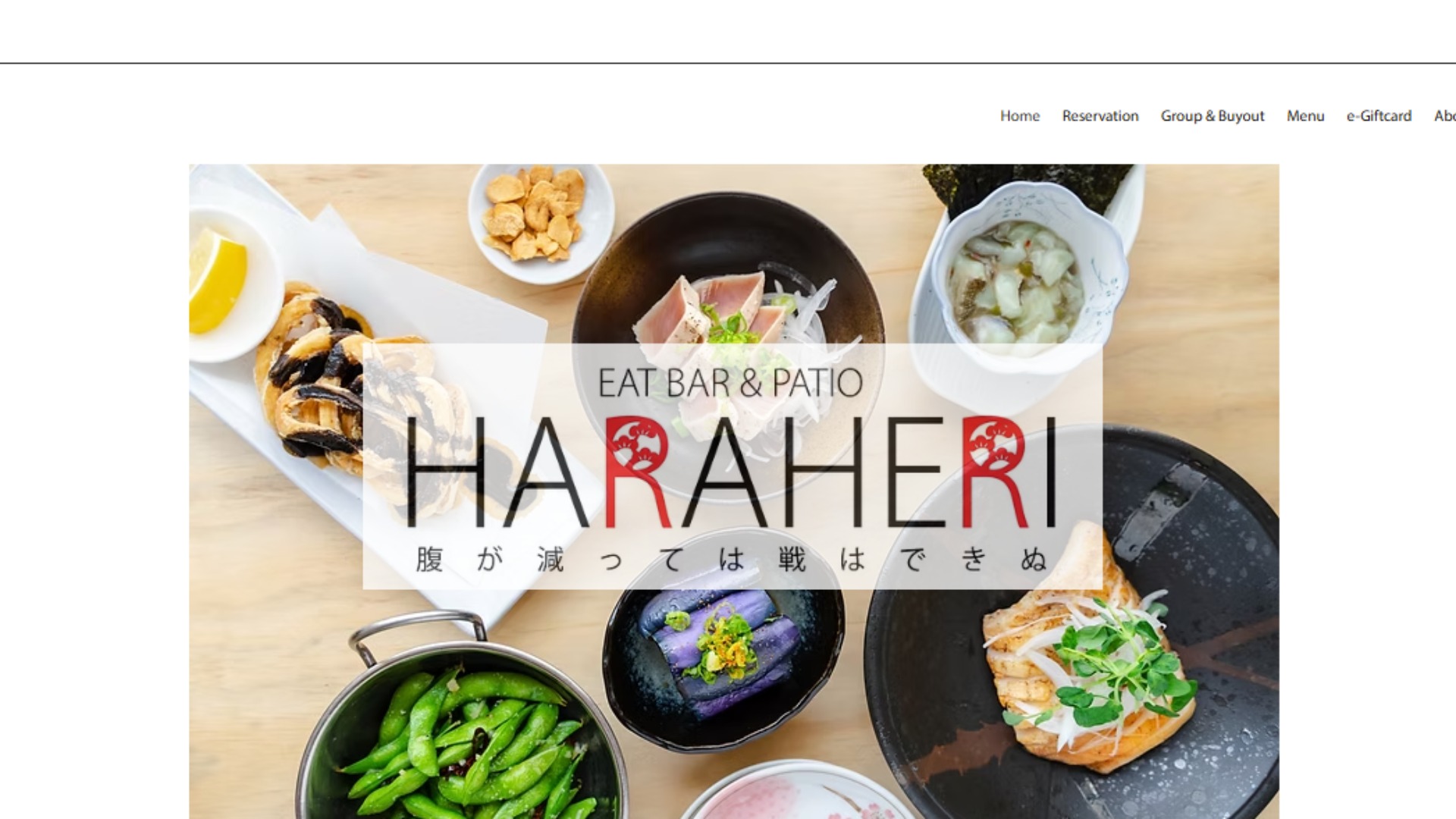
Haraheri: Turning Local Search Intent into Measurable Footfall Through SEO & Social
SeoGrowth as a serviceLocal Seo+1
Branding
MMake My Brand
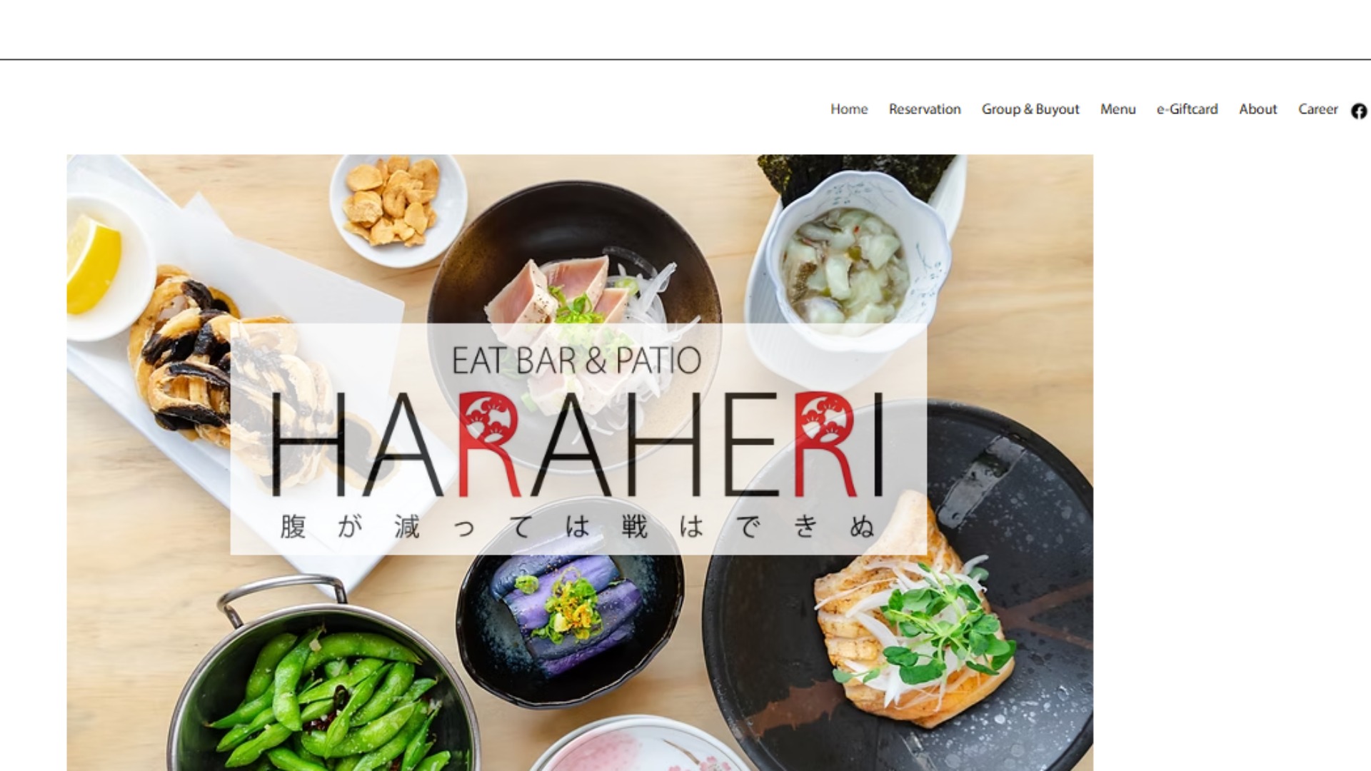
Haraheri: Turning Local Search Intent into Measurable Footfall Through SEO & Social
Growth as a ServiceOrganic Visibility (SEO)SMO
Branding
MMake My Brand
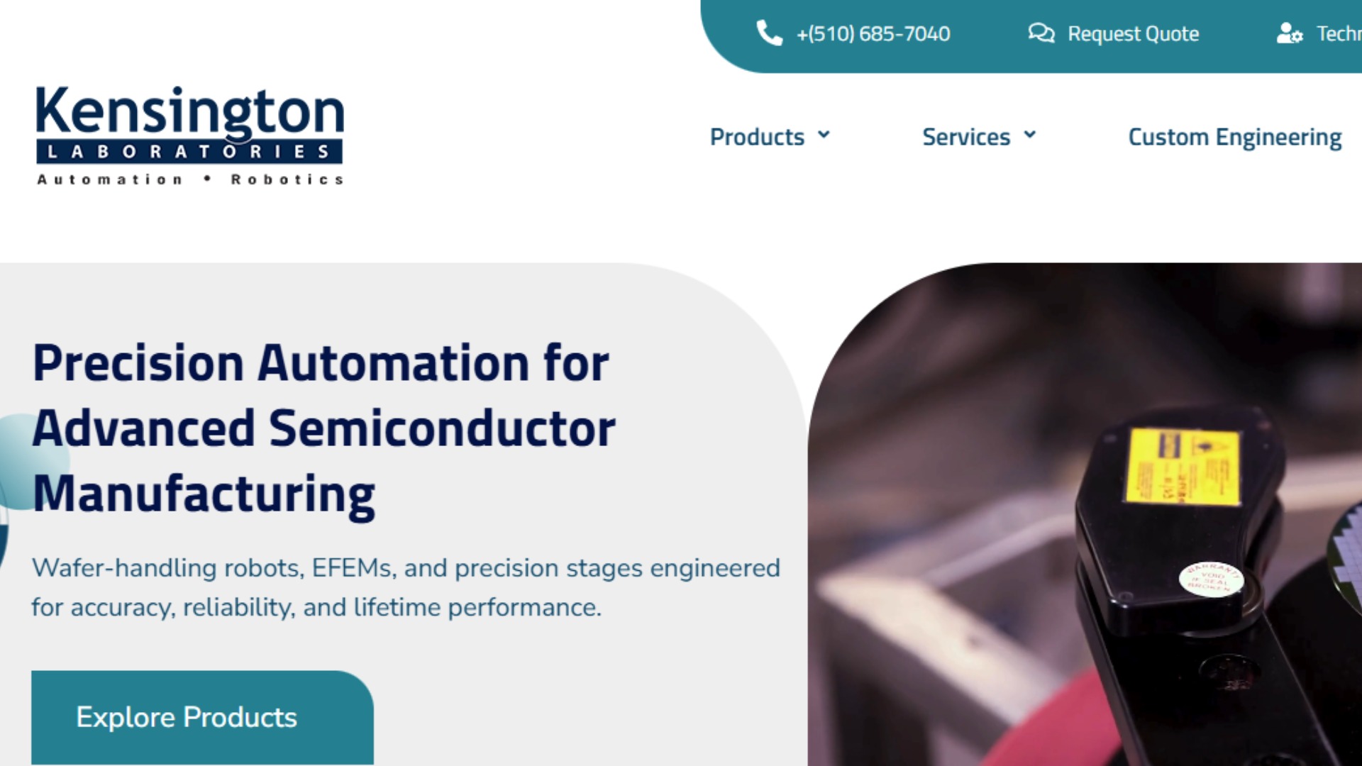
Kensington Labs: Igniting Organic Visibility & Engagement with SEO, UX, and Analytics
Website DevelopmentGraphic DesignGrowth as a Service+2
Branding
MMake My Brand
United Building Solutions: Engineering Performance-Led Growth Through Intent-Driven Paid Acquisition
Growth as a ServicePerformance MarketingGoogle Ads+1
Branding
MMake My Brand
Elder Law Scaling Trust and Visibility Through MMBs Growth-as-a-Service
Growth marketing servicesSEO Marketing ServicesPerformance marketing services+1
Project Details
P
Industry:Government & Public Sector
Budget:$50,000 - $100,000
Duration:6 - 12 months
Project URLBrandingWebsite DesignGraphic DesignConsultation
Need similar services?
Agencies providing branding
Posted this
P
Branding, Website and Graphic Design to Shine the Inside Out.
M
M
Growth Partner for Strategic Innovation
C
A design & development studio in Bangalore, India.
X
Growth-Driven Digital Marketing That Converts.
P
Empowering Brands through Innovative Branding and Digital Strategy
W
Wedding Music Band
T
Secure your wealth with Melbourne’s trusted private vault protection
S
Shaped By is a UK-based creative studio specialising in bold branding for ambitious B2B technology companies.
D
Elevate your business through digital innovation.