Branding
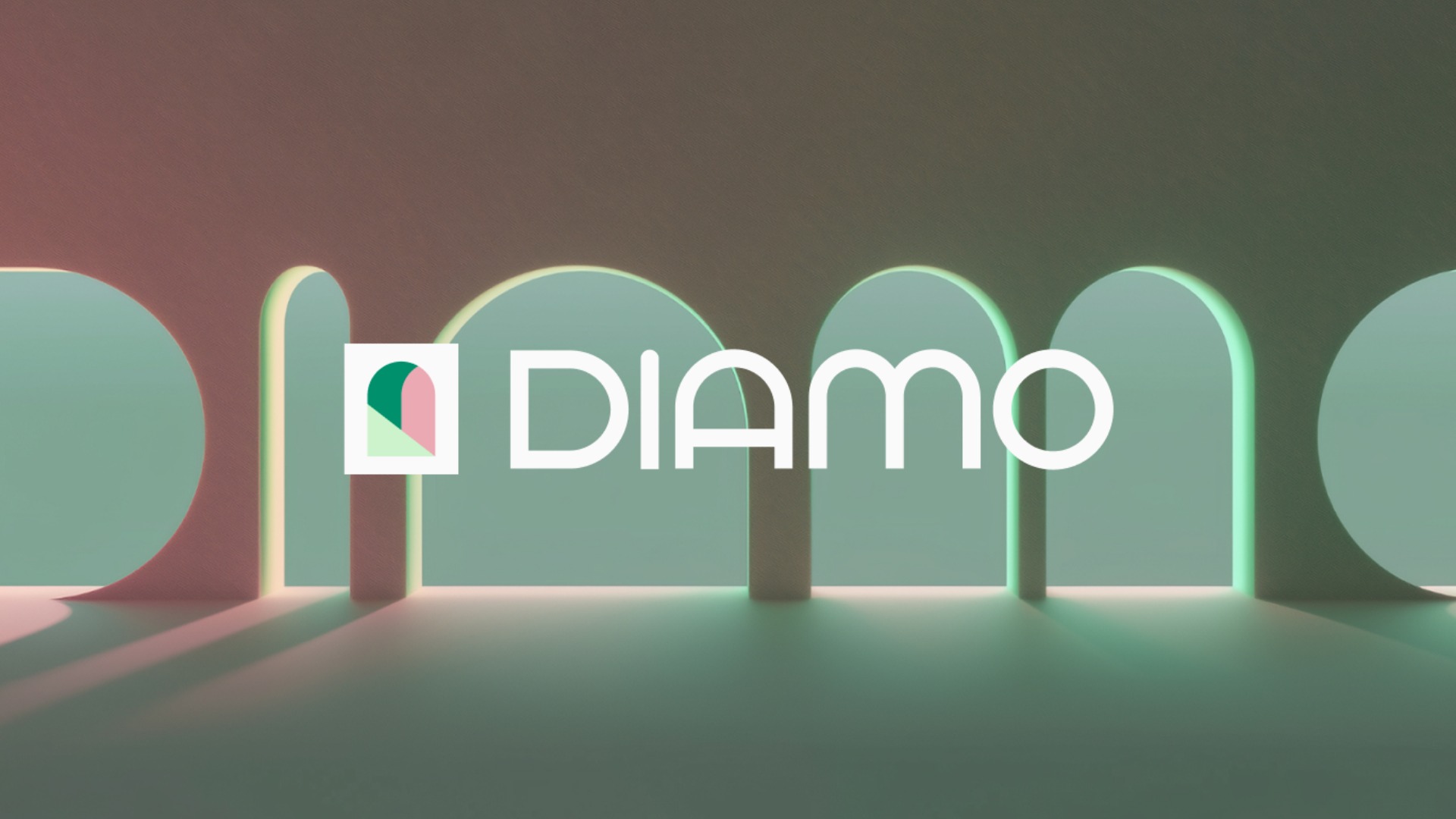
Diamo
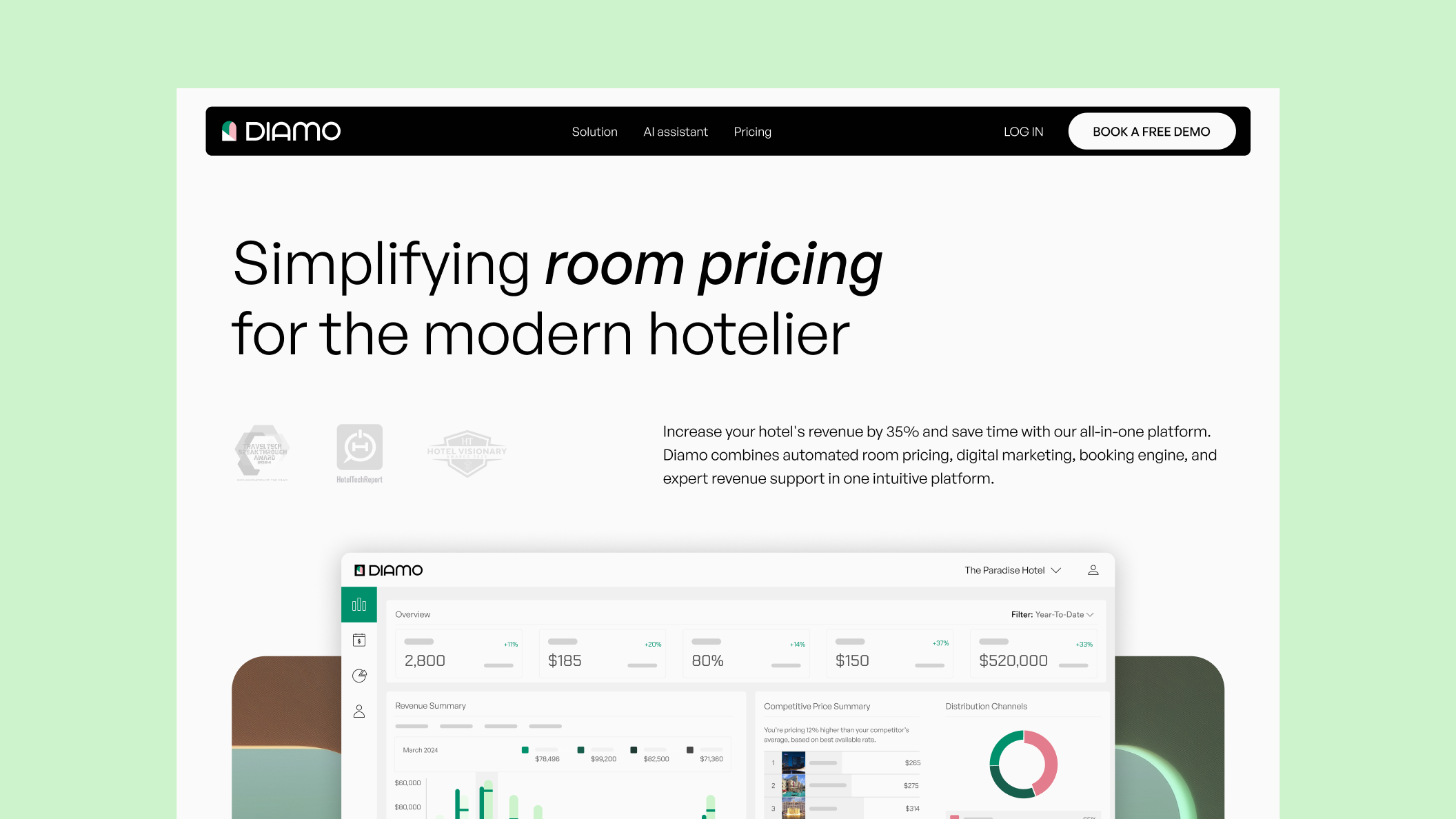
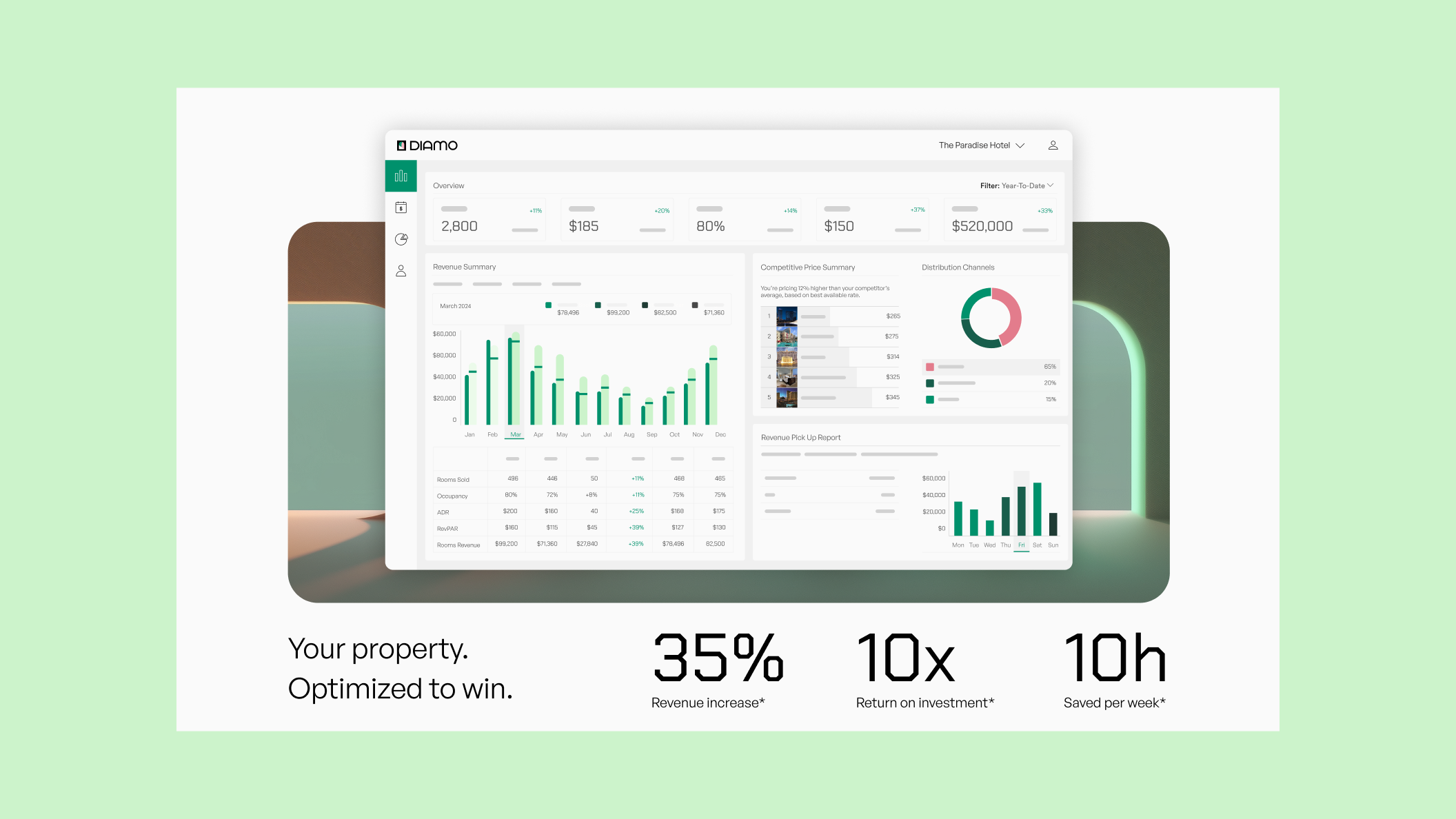
DIAMO combines AI-powered pricing, digital marketing, and a direct booking platform in one seamless product.
Within the strategic branding exercise, we came up with the "Open the door to growth" concept, which runs through the visual identity like a guiding thread. DIAMO is positioned as a door that helps hoteliers achieve success and drive innovation for their business.
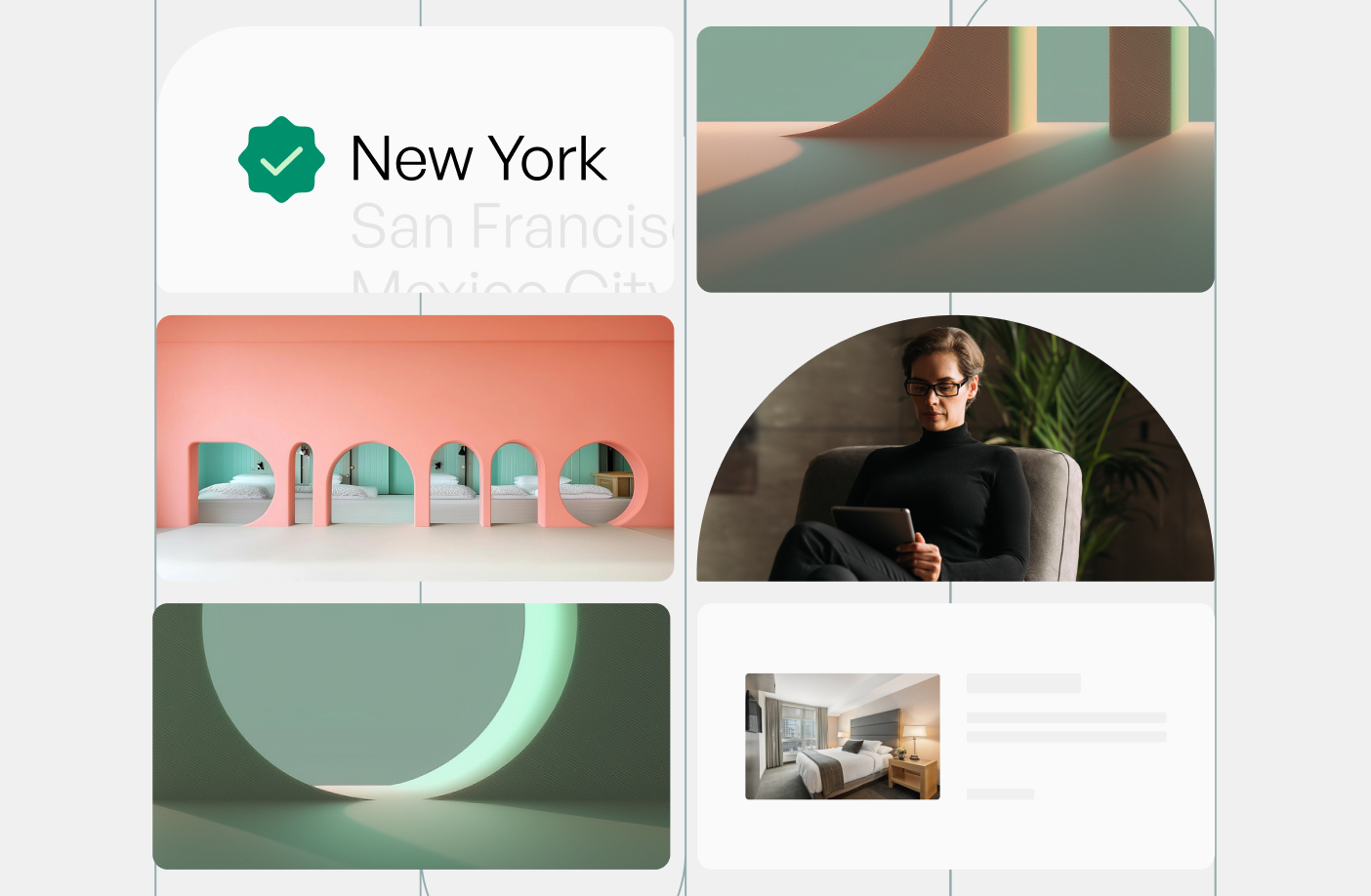
Across the logotype and the visuals, elements reminiscent of arches are visible, creating an inviting atmosphere. DIAMO's primary brand colors, green and pink, add to a tranquil, prosperous, and warm look and feel. The visuals give an Italian or Mediterranean flair, creating a sense of hospitality, friendliness, and a highly recognizable brand.
Other case studies from The Branx
Other branding case studies
Branding
MMake My Brand
Cars Centro: Redefining Automotive Marketplace Experience with Design-Led Innovation
Design & DevelopmentBrandingUI/UX Design+2
Branding
MMake My Brand
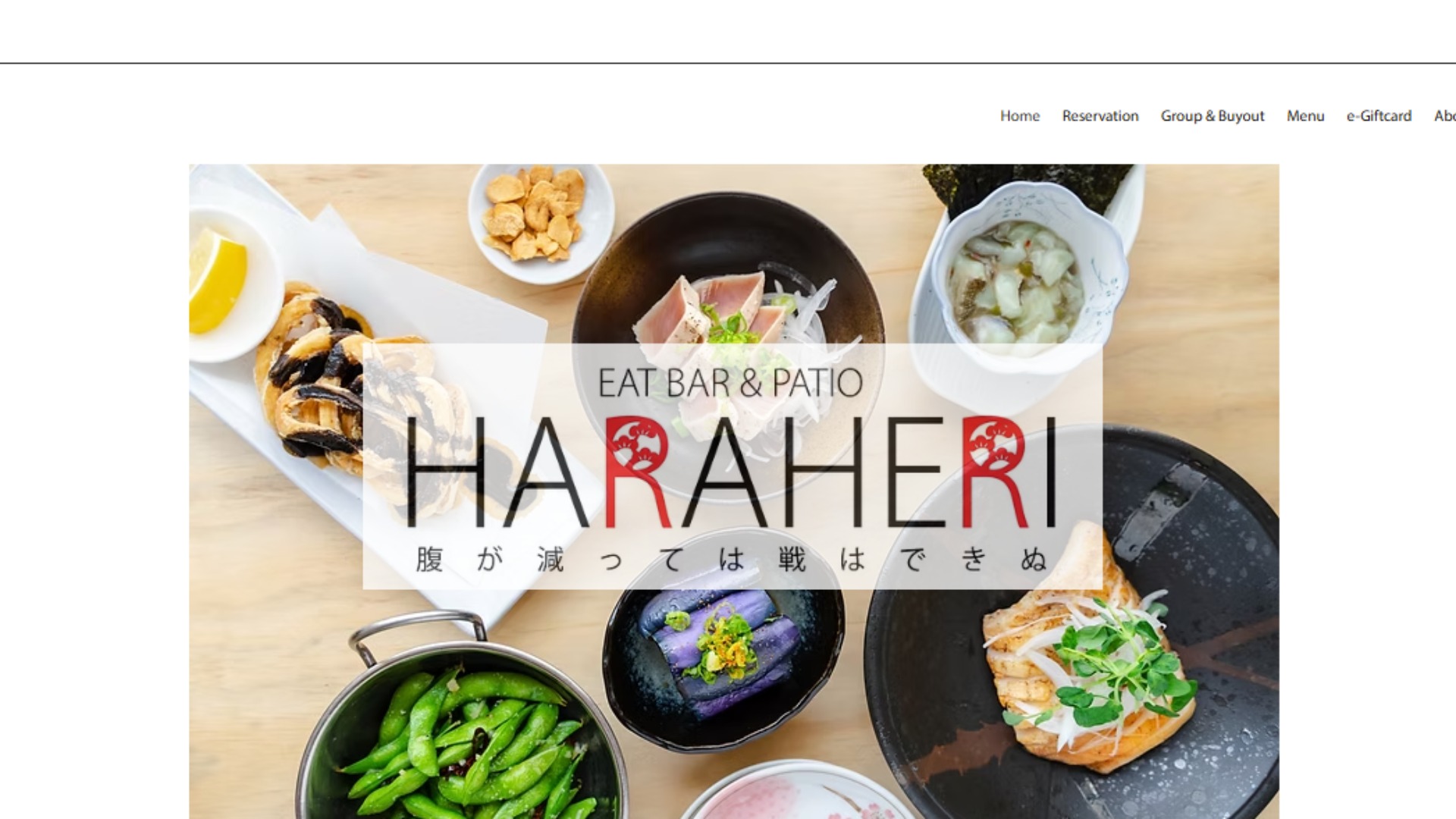
Haraheri: Turning Local Search Intent into Measurable Footfall Through SEO & Social
SeoGrowth as a serviceLocal Seo+1
Branding
MMake My Brand
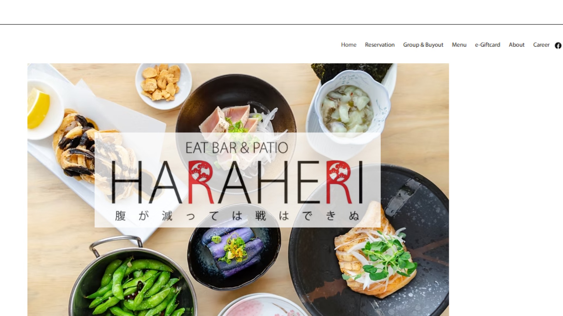
Haraheri: Turning Local Search Intent into Measurable Footfall Through SEO & Social
Growth as a ServiceOrganic Visibility (SEO)SMO
Branding
MMake My Brand
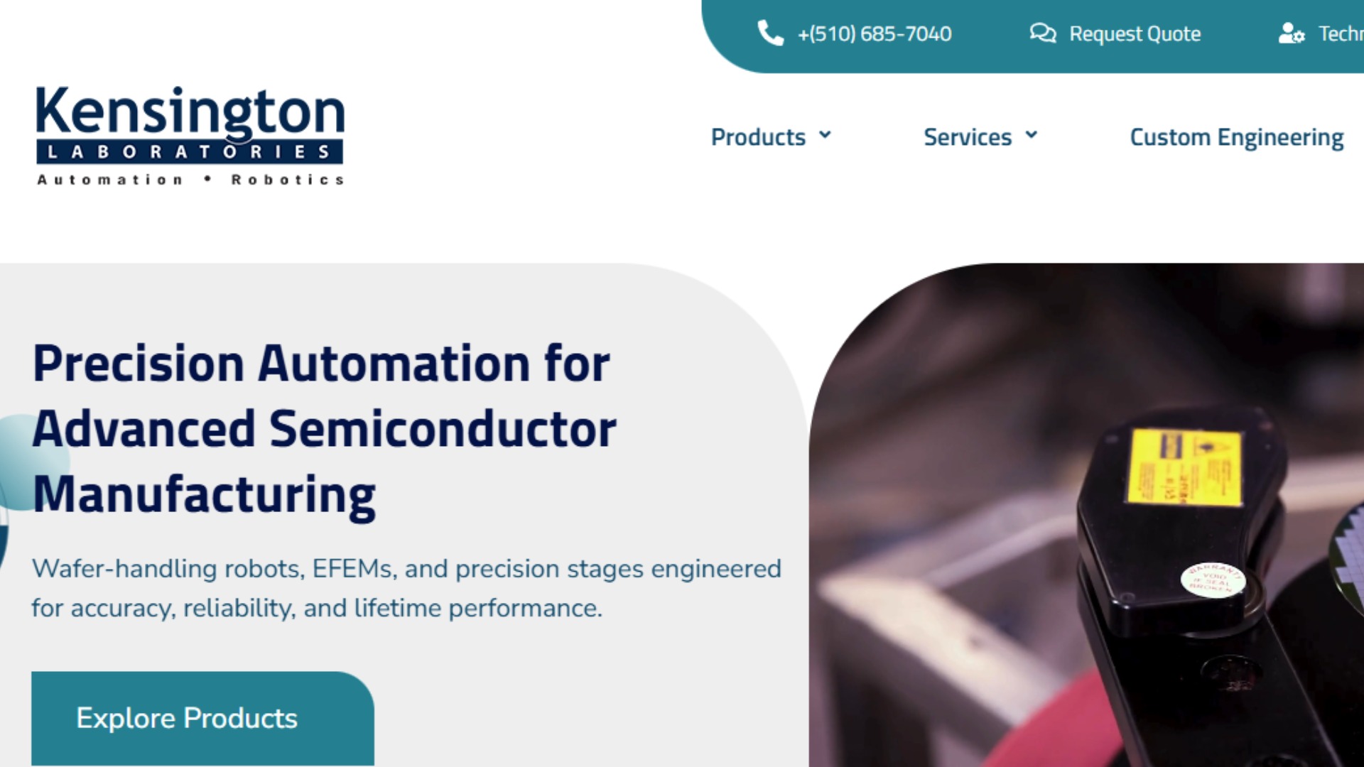
Kensington Labs: Igniting Organic Visibility & Engagement with SEO, UX, and Analytics
Website DevelopmentGraphic DesignGrowth as a Service+2
Branding
MMake My Brand
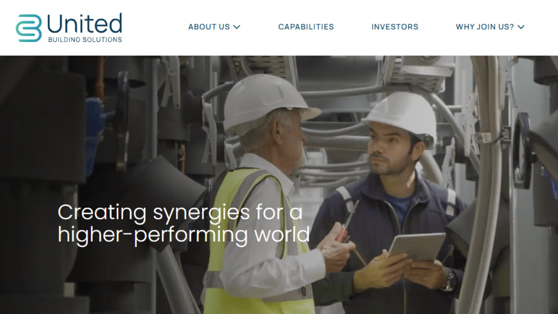
United Building Solutions: Engineering Performance-Led Growth Through Intent-Driven Paid Acquisition
Growth as a ServicePerformance MarketingGoogle Ads+1
Branding
MMake My Brand
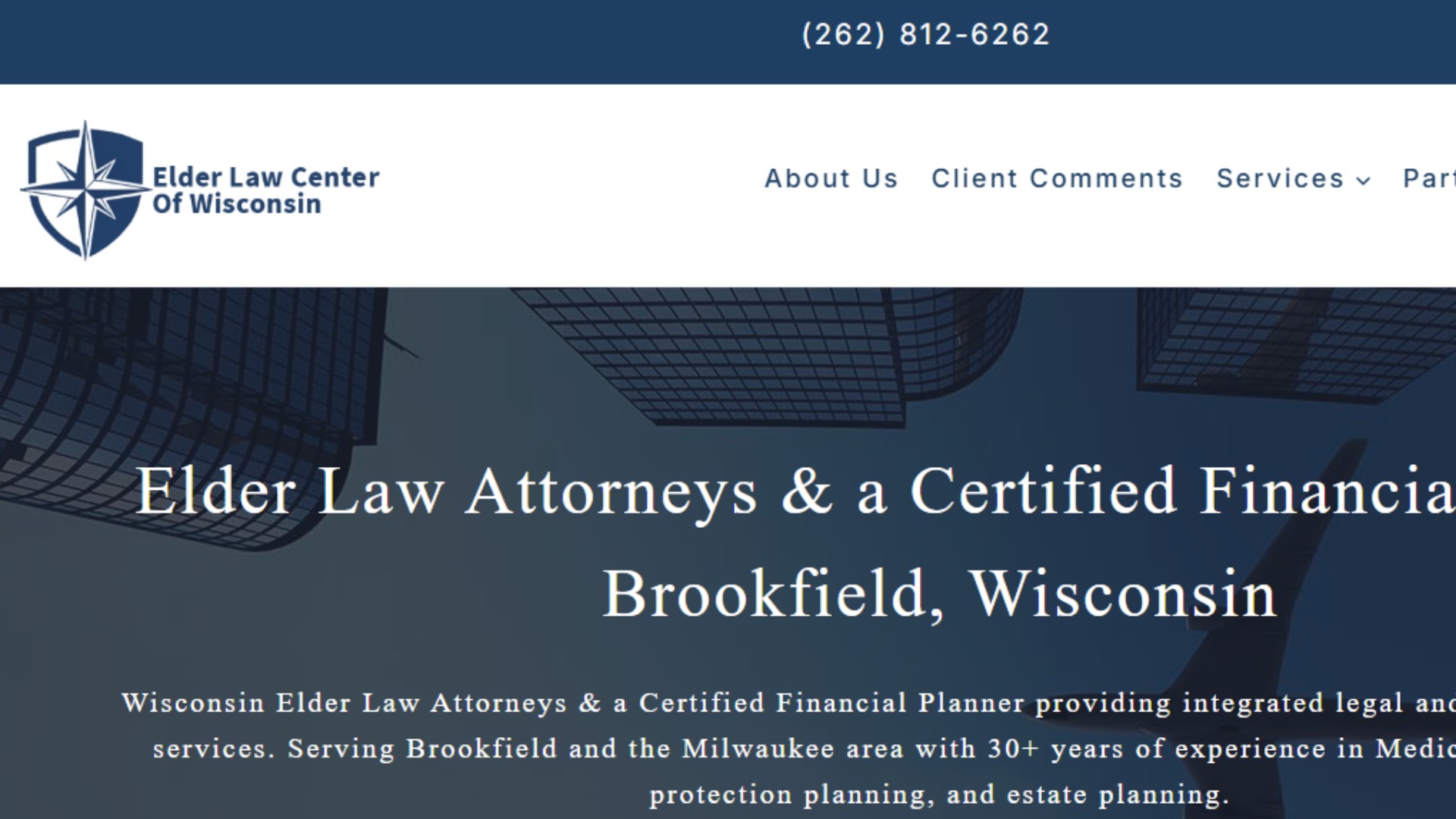
Elder Law Scaling Trust and Visibility Through MMBs Growth-as-a-Service
Growth marketing servicesSEO Marketing ServicesPerformance marketing services+1
Project Details
T
Industry:Startups
Budget:$10,000 - $50,000
Duration:1 - 3 months
Project URLtech brandstartup brandingstartup websitebrand designlogo designvisual identity
Need similar services?
Agencies providing branding
Posted this
T
Crafting powerful brands for tech startups to drive growth and value
M
M
Growth Partner for Strategic Innovation
C
A design & development studio in Bangalore, India.
X
Growth-Driven Digital Marketing That Converts.
P
Empowering Brands through Innovative Branding and Digital Strategy
W
Wedding Music Band
T
Secure your wealth with Melbourne’s trusted private vault protection
S
Shaped By is a UK-based creative studio specialising in bold branding for ambitious B2B technology companies.
D
Elevate your business through digital innovation.