Web & Software Development
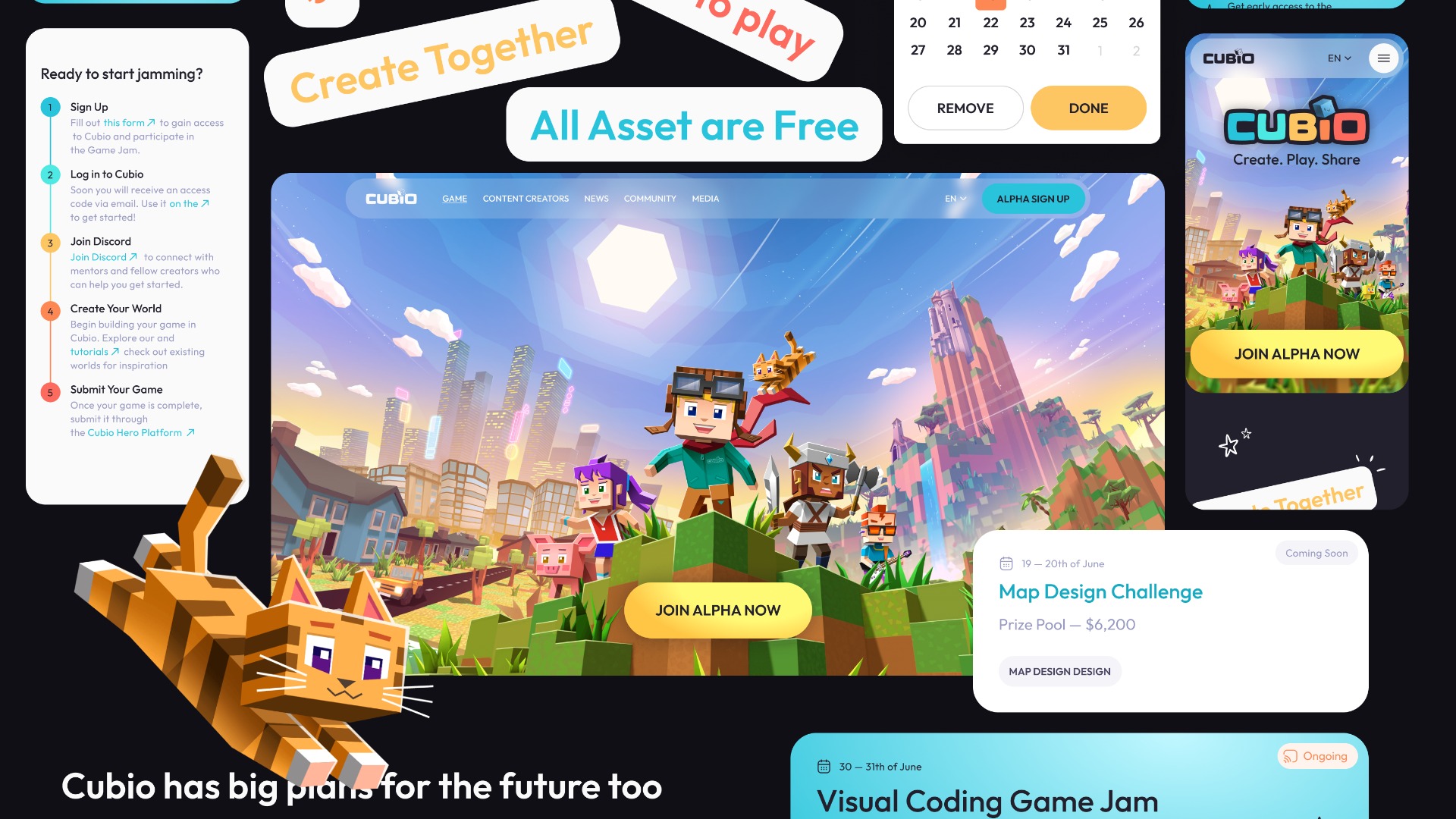
Studio23: Investments for zoomers
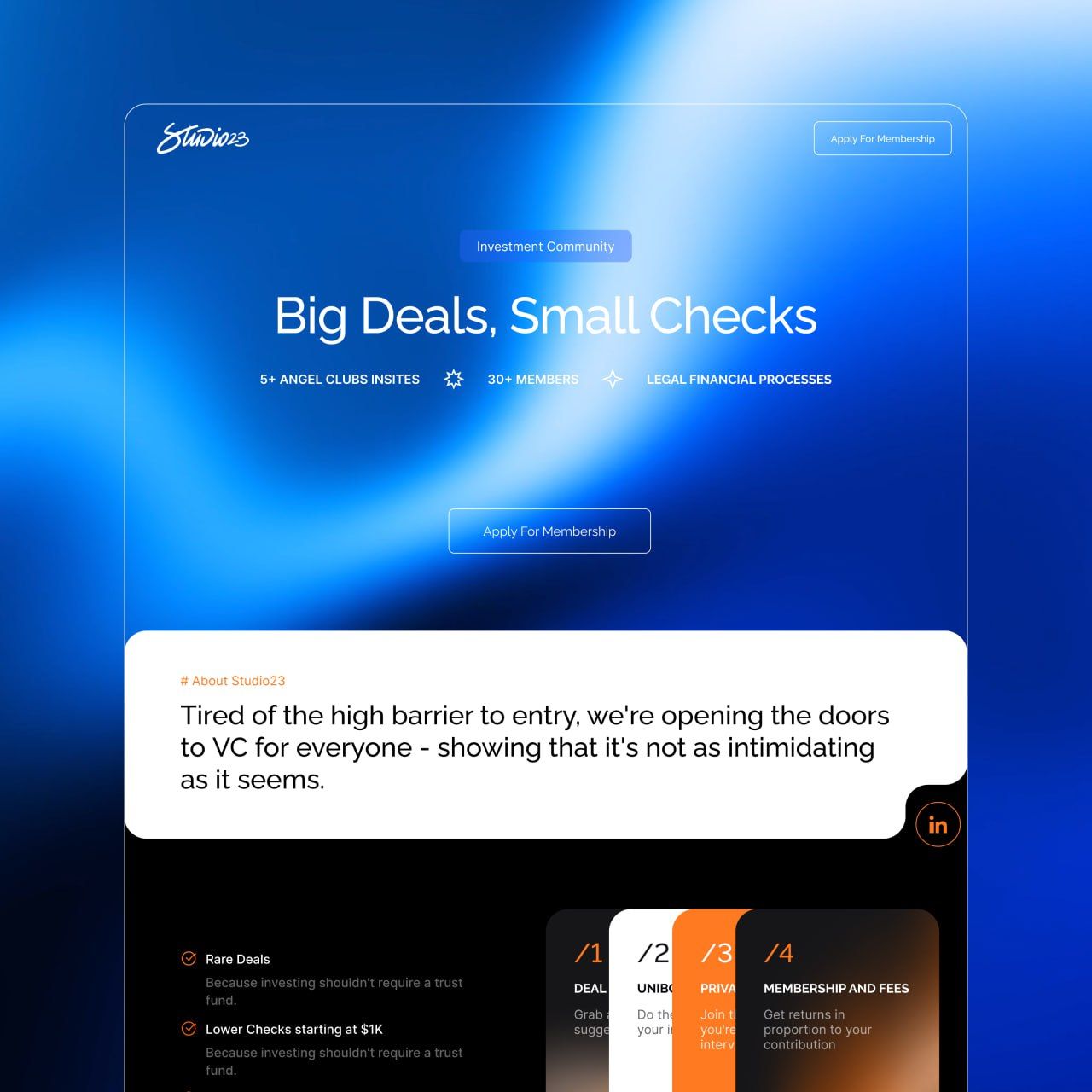
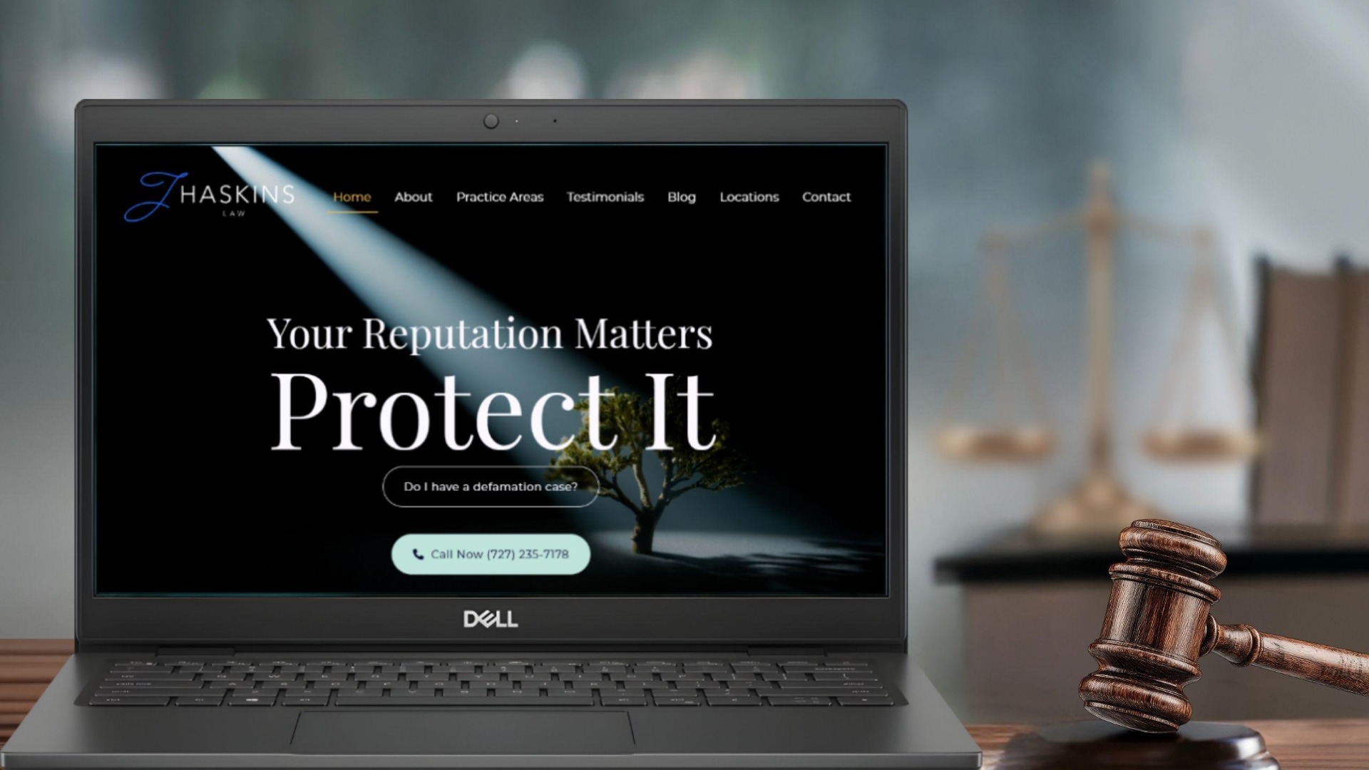
We’ve built a website for a young-investor club aimed at Zoomers. Studio23 is a community where first-time investors can step into venture deals together and join unique projects.
Who’s it for?
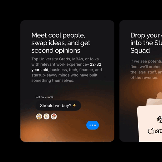
Studio23 speaks to active, ambitious Gen Z: senior students and recent grads from Europe’s top universities, who want to invest in ideas, not just stocks. Their pain points: no experience, small tickets that can’t enter big funds, and low-quality projects on crowdfunding sites. Studio23 fixes this with a tight-knit community, rare deals, and support at every step.
What was the main challenge in this project?
Building the brand from scratch
We mixed the seriousness of finance with youthful energy.
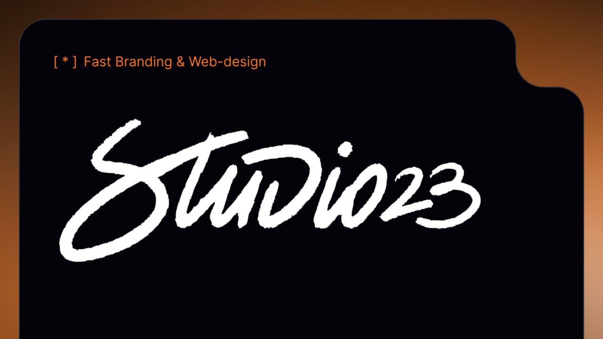
A handwritten logo shows live conversation and the fast path from a napkin sketch to an MVP. Every letter is unique, highlighting creativity.
The client's team also wanted a dark background. Grunge-style graphics fit the mood perfectly. Bright gradients on black hint at pulsing energy, and the shifts add motion.
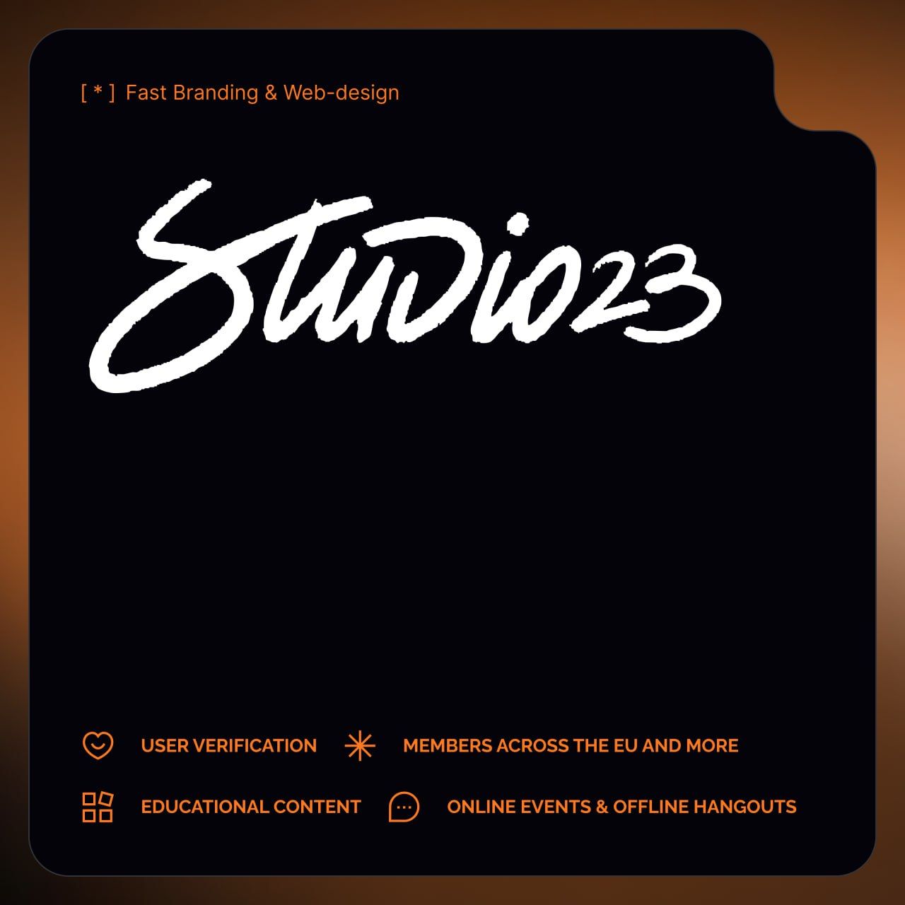
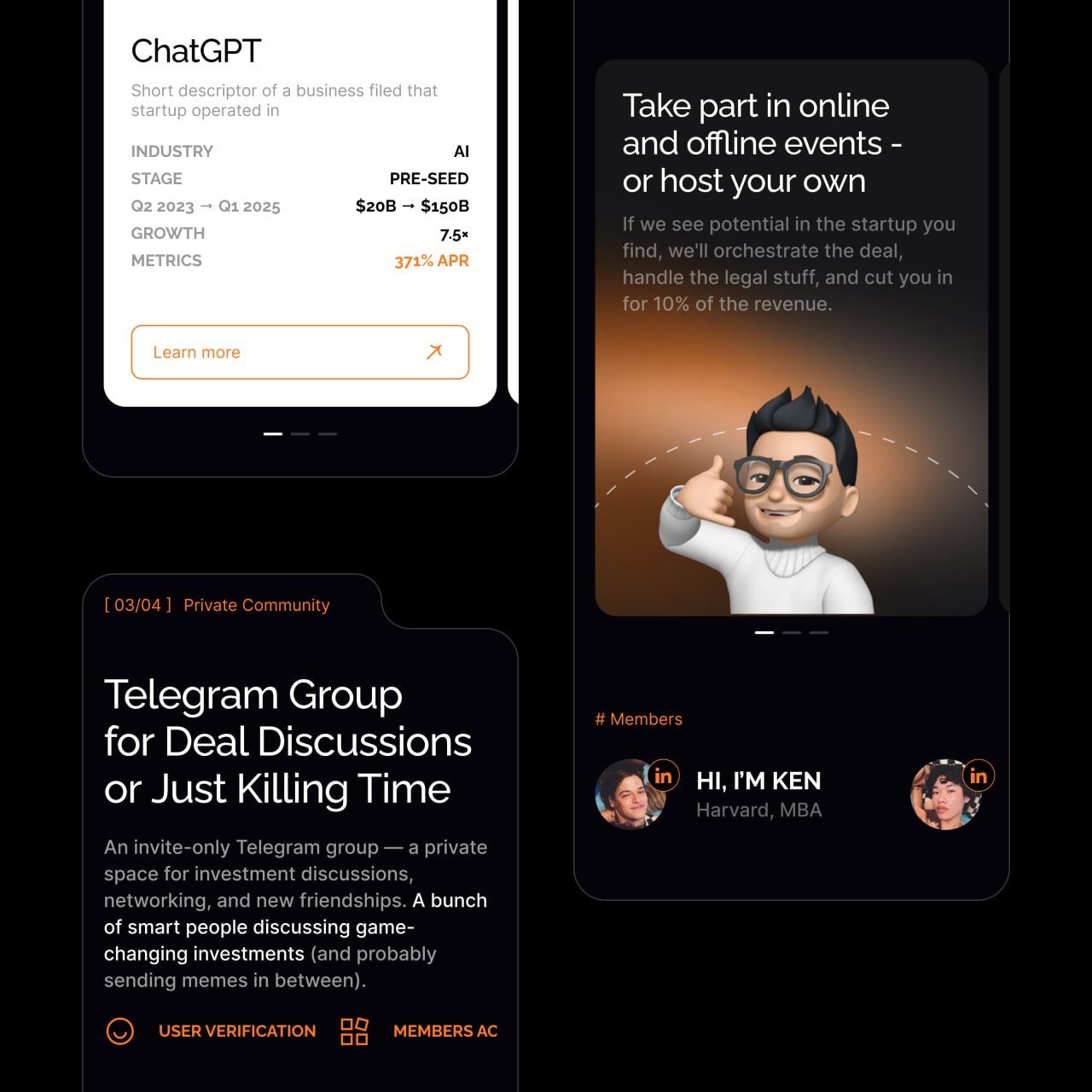
Cards and bento-style blocks are common in start-ups, but we gave them an unusual shape. The wavy border around the four main sections draws the eye to our step-by-step story about how easy investing is with Studio23.
Storytelling without the boring bits
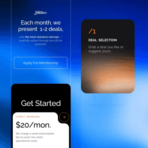
The landing page feels like a friendly chat, not a lecture. We split it into four key sections: deal Selection, platform, community, membership and spotlight them up front so readers get the idea fast.
Fonts
A restrained grotesque paired with micro-details like square brackets and thin lines keeps the tech vibe.
The “mandarin on dark” palette is bright, high-contrast, and expressive.
We highlight keywords in every paragraph because Zoomers stay focused for only eight seconds and we need to get the message across quickly.
Other case studies from REBOOT STUDIO
Other web & software development case studies
Web & Software Development
Web & Software Development

Web & Software Development
Web & Software Development

Web & Software Development
Web & Software Development
Project Details
Need similar services?
Agencies providing web & software development
Posted this
R
Connecting business and people through creative technologies.
B
We design, we build, you scale.
H
Software Company In Karachi
C
Your business's website and marketing partner
7
Transforming industries through innovative software solutions 🚀
C
Establishing online presence through innovative digital solutions.
S
Your All-in-One Partner for Web Design and Digital Marketing Solutions
P
Digital Solutions
P
Expert online marketing solutions for your business.
T
Your Gateway to Seamless Digital Integration
O
Transforming Businesses through Excellent Mobile App Solutions